

NYC Partners of Prevention
NYC POP
Visual Identity, Logo Design
Visual identity and logo design for a New York based coalition of organizations and agencies focused on substance use prevention and campaigns.
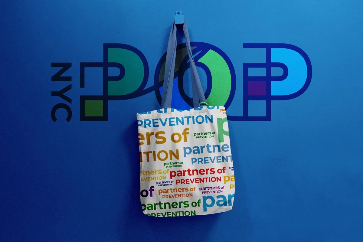
NISHLA Design was asked to create a dynamic visual identity that could capture the essence of NYC POP and its shared purpose. Influenced by the vibrant colors and line styles of the iconic New York City subway map designed by Massimo Vignelli, Bob Noorda and Joan Charysyn, the identity celebrates connection, movement, and accessibility.
Just as the subway connects New Yorkers from every walk of life, the NYC POP identity brings together the city’s prevention coalitions under one cohesive visual system. Bold, inclusive, and full of energy, the brand captures the unmistakable rhythm of New York while visually expressing NYC POP’s dedication to collaboration, community, and lasting social impact.
Each element was designed to be both functional and expressive: clear enough to unify a network of diverse coalitions, yet flexible enough to allow for local personalization.
Built with versatility at its core, the NYC POP design system was crafted to adapt seamlessly across a wide range of applications. The visual framework features bold color pathways, geometric linework, and an adaptable grid structure inspired by the organized chaos of the subway map.
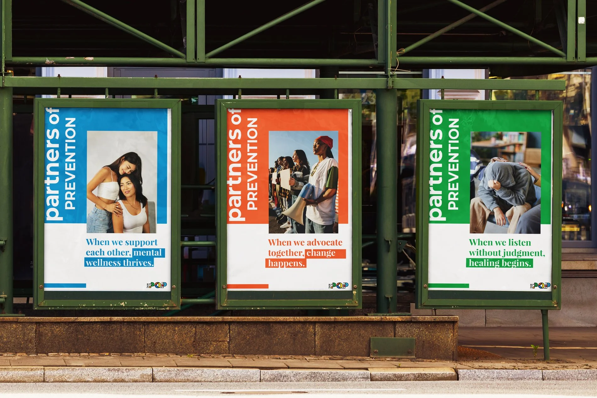
The flexible design system has made it easy for partners to co-brand campaigns, share resources, and amplify the prevention message citywide.
Beyond recognition, the brand has become a symbol of collaboration — proof that when diverse communities align around a shared purpose, the result is both powerful and unmistakably New York. What was once a collection of separate coalitions now feels like a connected network.